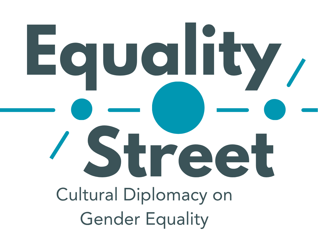
We have prepared some ideas for a logo of the project. Options all focus on primary school age groups and on the name of the project. We thought of having a friendly one that is not so corporate given the topic and given that the project is quite a playful one involving cultural diplomacy activities in class.
It would be great to have some comments from all or some of you before we continue working on them. Feedback can be given in the comments below. We are also open to having a main one that is logo and then the others would be versions of it used to promote the project and to distinguish between school activities, training resources etc. but we would rather always have one that represents the project.


Logo
I like the first one (but the second one is nice too). Personally I wouldn't create multiple logos, because this may cause confusion...
Logo
The first one is my favourite. I also agree with Marta to have only one logo for all the purposes.
Qawra Pr - Branding choice
I would go for number 3 as it is a simple logo but in my opinion quite effective. Numbers 1 & 2 are too commonly found across the internet in terms of design.
I like the first one and the third one most
The first one because the diversity is more evident and all children are holding the street post consolidating the idea of equality and togetherness. The third one is simple and fun, I would enhance with more diverse students. Something to consider is that students with disabilities are not represented in any of the logos.
Logo 3 selection
We like this one as it is easy to read and watch (text as child) - LABA team
logo
I like the first one because it is immediate, even though it may be similar to other images already seen (particularly on interculture). I would exclude the last one because the pyramid in my opinion refers to a hierarchical dimension.
Logo built based on comments
Here is a version of the logo built on previous design this time with effort make it higher and closer to a square etc. Thank you all for your contributions in this forum and via email.
Logo
I prefer the 1st and the 2nd logo. I also am against the idea of multiple logos, because this may cause confusion...